Data Aggregation Techniques for Effective Data Analysis. Reviewing Key Concepts
Daily interactions between businesses and customers generate tons of data. It can help companies shift from intuitive to data-driven decision-making when collected and handled right. However, vast raw data datasets are uneasy and barely possible to analyze.
Luckily, many techniques help summarize them into manageable insights. They seem pretty straightforward at first sight, but effective data aggregation demands sophisticated understanding and strategic application. Today, we'll consider major strategies tailored for robust data analysis and look at some examples to better understand how they work.
What Is Data Aggregation?

Data aggregation embraces many activities that help collect and summarize data from various sources to facilitate statistical analysis and improve decision-making. It involves multiple approaches to help you gain insights into your business performance, customer behavior, market trends, and more. You can classify data aggregation techniques in many ways, but they can be divided into the following major types.
Data aggregation types by dimension:
Time aggregation involves gathering all data points for a single resource over a specific period. For example, grouping data points based on time intervals, such as yearly, monthly, weekly, daily, or hourly. This type of data aggregation can help you track significant trends and identify seasonal fluctuations;
Spatial aggregation implies collecting all data points for a group of resources over a given period, for example, calculating the total number of visitors or leads across all marketing channels. Spatial data aggregation can help consolidate data, eliminate data silos, and enhance analysis.
Data aggregation types by process:
Manual aggregation involves collecting data from different sources, like spreadsheets, databases, or applications, and then summarizing it yourself. It's a pretty straightforward approach suitable for small datasets. The obvious disadvantage is that making things this way can be time-consuming and error-prone if you have to deal with a large number of data points;
Automated aggregation, on the other hand, leverages dedicated software tools and platforms to collect, clean, and aggregate data automatically. It's efficient, accurate, and scalable, making it ideal for larger datasets and real-time analysis.
How to Collect and Store Data Properly?
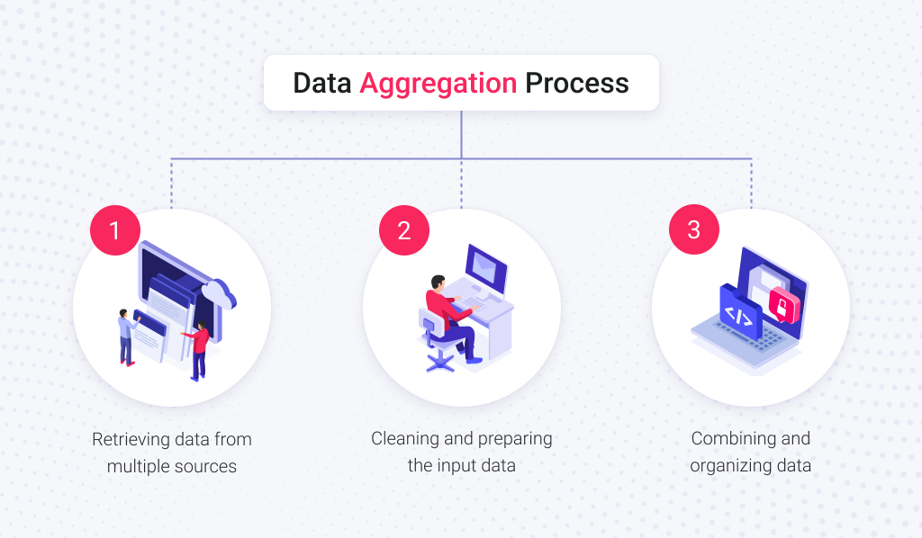
You need a strong foundation before you can build your house of knowledge. In data aggregation, you can rely on Extract, Transform, and Load (ETL) processes, Data Preparation, and Data Warehousing.
ETL allows extracting data from disparate sources. It’s helpful when you need to gather information from sales records, customer databases, and social media platforms. Making it manually or building a suitable software solution from scratch may be labor-intensive. Therefore, you can rely on AWS Glue, Azure Data Factory, and other solutions.
Even if you have such tools in your possession and can retrieve any information you need from multiple sources, this raw data might be inconsistent, formatted differently, or even contain errors. That's where data preparation steps in. It helps to clean, standardize, and transform the data into a uniform and usable format. Tools like Datameer, Tableau Prep, and many others can be helpful here.
Finally, the data warehouse serves as a central repository designed to store and manage the aggregated data efficiently. It provides a single source of info, allowing for efficient analysis and exploration of insights.
Read Also: Data Warehouse vs Data Lake: Key Difference and How to Choose an Appropriate Option
Data Aggregation Applications in Different Industries
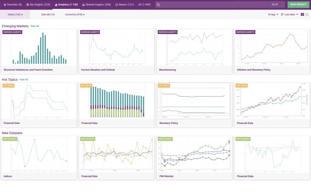
In finance and investment, you can aggregate economic data, news feeds, and social media sentiment to detect market fluctuations and promising investment opportunities better. Combining transaction data from different sources allows for real-time fraud detection and risk management. Also, companies can offer customized financial products and services by analyzing spending habits and investment preferences. Data visualization can turn indicators into intuitive graphs and charts, resulting in efficient and intuitive economic research tools:

Logistics and transportation can use real-time traffic data and weather information to optimize delivery routes and predict arrival times. Plus, vehicle sensor data can be aggregated to predict maintenance needs and ensure efficient fleet operation.
Retail and e-commerce companies can benefit from data aggregation for more efficient customer segmentation and targeting. For example, data from online purchases, loyalty programs, and social media engagement helps understand customer demographics and tailor marketing campaigns. Aggregated sales data and customer trends enable forecasting future demand and optimizing inventory levels. Analyzing competitor pricing and customer response data allows for dynamic pricing strategies and targeted promotions.
Healthcare companies can aggregate patient data from various sources to predict health risks, build personalized treatment plans, and manage chronic diseases. Data gathered from extensive patient records and medical research datasets can aid in developing new drugs and optimizing clinical trials. Large-scale data aggregation can also help track disease outbreaks and analyze multiple risk factors.
Examples of Data Aggregation Techniques
Even when your data is collected, prepared, and stored correctly, you still have to extract valuable insights from it. Luckily, there are tons of techniques allowing you to do it. In this chapter, we'll consider some of them.
Read Also OLAP vs OLTP: The Best Method of Analyzing Aggregated Data in SaaS
Drill-down
Drill-down is vital when you work with vast and overwhelming datasets. Imagine a report showing total company sales. Drill-down allows navigation from the general view to the more specific indicators. For example, you can zoom in on individual regions, product categories, or even particular stores, revealing the factors driving the overall trend. Such a data exploration technique helps identify patterns, anomalies, and hidden gems that might otherwise remain invisible.
Original Dataset:
| Date | Product | Category | City | Sales |
| 2023-12-01 | Shirt | Clothing | London | 100 |
| 2023-12-02 | Shirt | Clothing | Paris | 150 |
| 2023-12-03 | Jeans | Clothing | London | 200 |
| 2023-12-04 | Jeans | Clothing | New York | 180 |
| 2023-12-05 | Dress | Fashion | New York | 250 |
Drill-down Example:
Total Sales: 880
Clothing Sales: 630
London Clothing Sales: 300
Individual Product Sales in London by product:
| Jeans | 200 |
| Shirt | 100 |
Roll-up
Roll-up enables ascending levels of granularity. For example, you may have a detailed sales report with information on every individual transaction. To identify broader trends, you can use roll-up to combine data points at lower levels (e.g., individual transactions) into higher levels (e.g., daily and monthly sales). Thus, it'll be easier to identify overall patterns and trends.
Original Dataset:
| Date | Product | Sales |
| 2022-01-01 | A | 100 |
| 2022-01-01 | B | 150 |
| 2022-02-01 | A | 120 |
| 2022-02-01 | B | 200 |
Roll-up by Month Example:
| Date | Product | Sales |
| 2022-01-31 | AB | 250 |
| 2022-02-28 | AB | 320 |
Slicing and Dicing
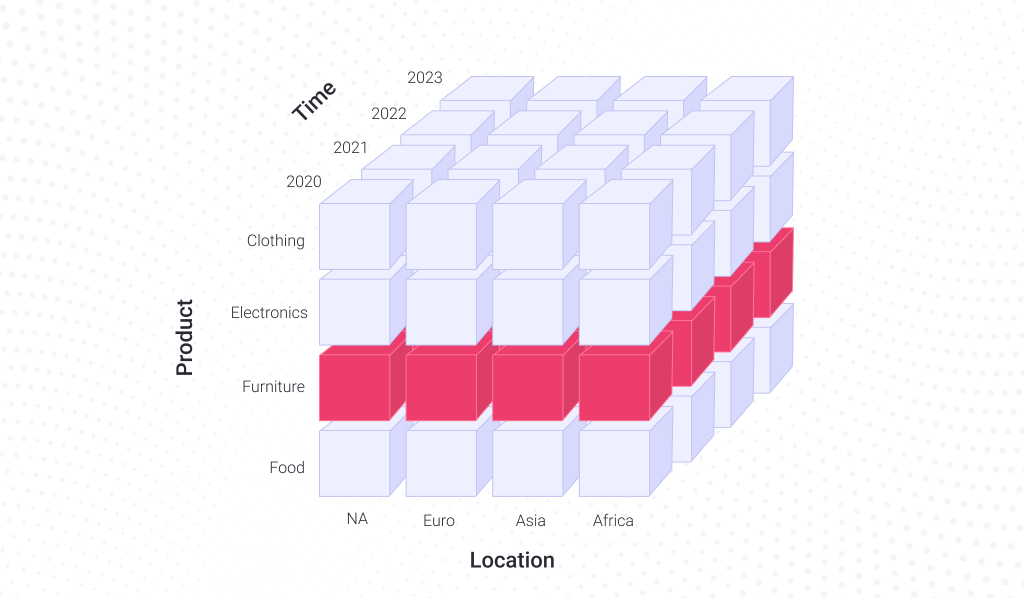
Slicing and dicing are applicable to multidimensional datasets. Say if you deal with sales data that includes dates, products sold, and store locations, you can imagine it as a cube, where each face corresponds to these groups of indicators:

Slicing works like a sharp knife, allowing us to isolate specific subsets of data based on a single dimension. For example, it allows focusing on a particular product sold in a specific location.
Original Dataset:
| Date | Product | Category | City | Sales |
| 2023-12-01 | Shirt | Clothing | London | 100 |
| 2023-12-02 | Shirt | Clothing | Paris | 150 |
| 2023-12-03 | Jeans | Clothing | London | 200 |
| 2023-12-04 | Jeans | Clothing | New York | 180 |
| 2023-12-05 | Dress | Fashion | New York | 250 |
Slicing Example:
Total clothing sales in London: 300
Total sales in the first three days: 450
Dicing, on the other hand, works like a zoom feature. It allows us to focus on a smaller subset of data from the initial dataset by selecting specific values along dimensions. You can review the aggregated data more accurately or perform specific calculations with it.
Original Dataset:
| Time | Region | Product | Sales |
| Jan | North | A | 100 |
| Jan | North | B | 150 |
| Feb | North | A | 120 |
| Feb | South | B | 200 |
| Mar | North | A | 90 |
| Mar | South | B | 120 |
Diced Cube:
| Time | Region | Product | Sales |
| Jan | North | A | 100 |
| Jan | North | B | 150 |
Average Sales in Diced Cube: 125.0
Combining slicing and dicing, you can identify targeted segments for specific customer groups or product categories that require tailored strategies. Analyzing different dimensions can reveal surprising connections between seemingly unrelated factors.
Data Fusion
This approach allows combining data from multiple sources with potentially heterogeneous formats or structures. For example, you can combine information like product type, features, quantity sold, sales location, and price with a dataset containing customer satisfaction reviews. This new dataset can help find correlations between specific product features or characteristics identified in sold product data and sentiment expressed in reviews.
Dataset One:
| Customer ID | Product | Sales |
| 1 | A | 100 |
| 2 | B | 150 |
| 3 | A | 120 |
| 1 | B | 200 |
| 2 | A | 90 |
Dataset Two:
| Customer ID | Name | Location |
| 1 | Alice | City1 |
| 2 | Bob | City2 |
| 3 | Charlie | City1 |
| 4 | David | City3 |
Fused Dataset:
| Customer ID | Product | Sales | Name | Location |
| 1 | A | 100 | Alice | City1 |
| 2 | B | 150 | Bob | City2 |
| 3 | A | 120 | Charlie | City1 |
| 1 | B | 200 | Alice | City1 |
| 2 | A | 90 | Bob | City2 |
Pivoting
Pivoting allows reorganizing data to offer a more transparent and more insightful perspective. A spreadsheet with information on monthly sales figures for various products across different regions can be transposed by transforming rows into columns and vice versa. Such a shift in perspective may reveal new patterns and trends.
Original Dataset:
| Date | Product | Sales |
| 2022-01-01 | A | 100 |
| 2022-01-01 | B | 150 |
| 2022-01-02 | A | 120 |
| 2022-01-02 | B | 200 |
Pivot Table:
| Date | Product A | Product B |
| 2022-01-01 | 100 | 150 |
| 2022-01-02 | 120 | 200 |
Weighted Aggregation
Weighted aggregation implies that you can assign different importance to individual data points based on their relevance or specific characteristics. For example, when analyzing customer feedback, weighted aggregation allows you to give more weight to feedback from particular customer segments, like loyal customers or subject matter experts.
Two key components of weighted aggregation are:
Assigning Weights. Each data point receives a numerical weight based on a specific predetermined criteria;
Weighted Calculation. The aggregated value (average or sum) is then calculated by multiplying each data point by its weight and then summing the products.
Original Dataset:
| Product | Value | Weight |
| Chocolate | 95 | 3 |
| Chocolate | 51 | 2 |
| Chocolate | 83 | 4 |
| Milk | 127 | 5 |
| Milk | 42 | 7 |
| Milk | 48 | 3 |
| Bananas | 88 | 4 |
| Bananas | 91 | 6 |
| Bananas | 102 | 5 |
Weighted Average:
| Product | Weighted Average |
| Bananas | 93.866667 |
| Chocolate | 79.888889 |
| Milk | 71.533333 |
Time-Based Aggregation
When you work with data representing a continuous stream, you need to capture information across various points in time so that multiple data points won't obscure broader trends. The most obvious example of using this technique is to group data by specific time intervals, such as hourly, daily, or monthly. It may help to analyze social media engagement by detecting periods of most active user interactions.
More advanced examples include moving averages, seasonality adjustments, and time series forecasting. For example, a moving average calculates a dataset's average value over a specific rolling window. As new data points enter the window, the oldest data point drops out, and the average is recalculated. Traders can rely on moving averages to identify potential buy and sell signals. For example, a short-term moving average crossing above a longer-term moving average can indicate an upward trend.
Moving Average Example:
| Date | Sales | Moving Average, Days=3 |
| 2022-01-01 | 100 | - |
| 2022-01-02 | 150 | - |
| 2022-01-03 | 120 | 123.333333 |
| 2022-01-04 | 200 | 156.666667 |
| 2022-01-05 | 90 | 136.666667 |
| 2022-01-06 | 130 | 140.000000 |
| 2022-01-07 | 180 | 133.333333 |
| 2022-01-08 | 220 | 176.666667 |
| 2022-01-09 | 110 | 170.000000 |
| 2022-01-10 | 160 | 163.333333 |
Groupwise Transformations
Unlike many techniques that filter and summarize data, groupwise transformations take a different approach. Here, we speak of adjusting entire data groups within a dataset. Imagine a dataset containing sales figures for various products across different regions. To better understand such data, you can perform segmentation to divide it into meaningful groups and then perform transformations, such as normalization, ranking, calculations, etc. For example, you might calculate the percentage change in sales for each product between one month and the next, revealing growth rates across the entire dataset.
Original Dataset:
| Customer ID | Category | Sales |
| A1 | Electronics | 1000 |
| A2 | Electronics | 1500 |
| B1 | Fashion | 800 |
| B2 | Fashion | 1200 |
| C1 | Furniture | 2500 |
| C2 | Furniture | 3000 |
Groupwise Sales Mean and Standard Deviation:
| Category | Mean | Standard |
| Electronics | 1250.0 | 353.553391 |
| Fashion | 1000.0 | 282.842712 |
| Furniture | 2750.0 | 353.553391 |
Groupwise Sales Percentage Change:
| Category | Customer ID | Sales | Percentage Change |
| Electronics | A1 | 1000 | - |
| A2 | 1500 | 50.0 | |
| Fashion | B1 | 800 | - |
| B2 | 1200 | 50.0 | |
| Furniture | C1 | 2500 | - |
| C2 | 3000 | 20.0 |
Conclusions
Today, we discussed some core concepts of data aggregation. They may seem like a lot for an untrained eye, but industry professionals will easily name dozens of unmentioned techniques and tools. However, none of them reign supreme, and the optimal approach hinges on your specific data, analysis goals, and desired level of granularity and dimensionality. Therefore, one should carefully consider data characteristics and analytical requirements before choosing a particular technique.
Also, data aggregation is only a step toward uncovering valuable insights. It would be best to employ visualization techniques, such as interactive dashboards or heatmaps, to discover all the secrets that data holds.
